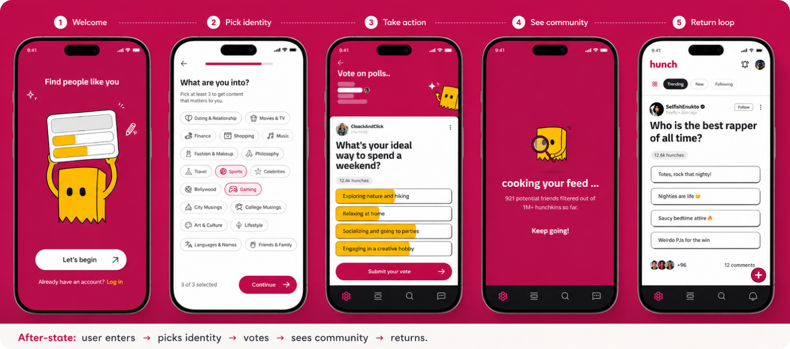
Retention improved because users found immediate participation value.
Users weren't dropping because onboarding was broken.
They were dropping because they never found a reason to participate. The original flow helped users enter the product, but it did not create enough social context or early interaction value.
Completion looked fine. Engagement never really started.
From analytics and session observations, we saw users enter the product, scroll briefly, bounce after a few actions, and rarely return. The system assumed users would naturally explore, but new users had no meaningful reason to act.
- Entered the product
- Scrolled briefly
- Bounced after a few actions
- Rarely returned
- Immediate value
- Social belonging
- Clear first action
- Return trigger
- Better D1 retention
- More poll participation
- Profile completion
- Repeat engagement loops
The existing FTUE was functional, but not motivational.
Mapping the original flow stage by stage exposed where the user's emotional state broke down, from neutral, to transactional, to administrative, to a feed with no framing for participation.
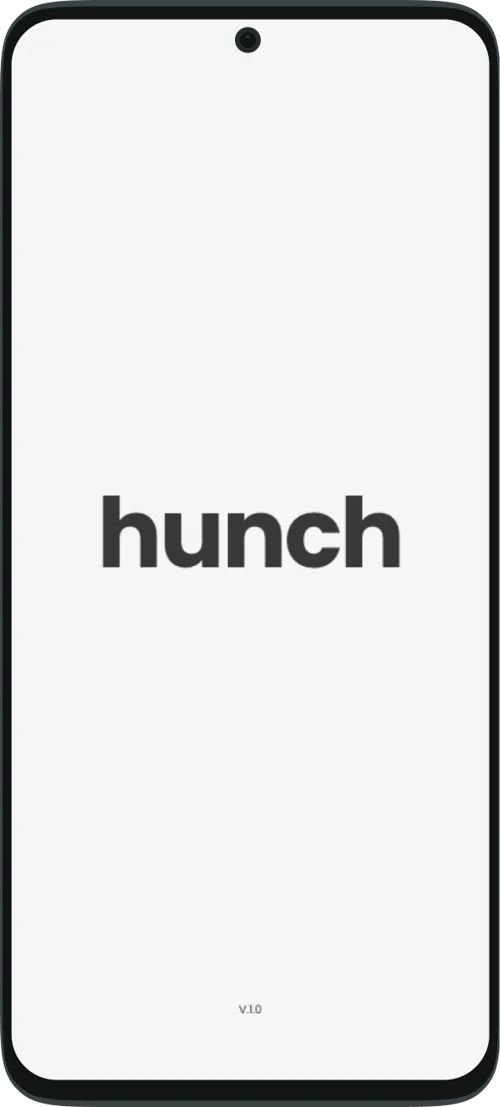
Just a logo. No reason to lean in.
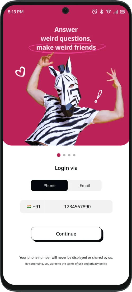
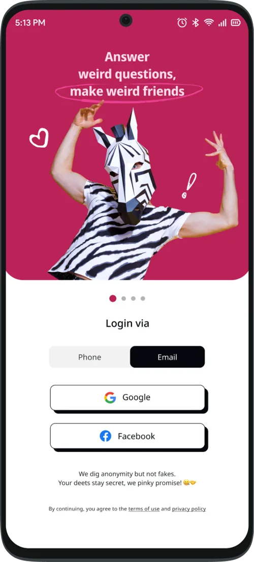
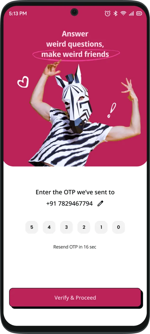
Verify first, value… eventually.
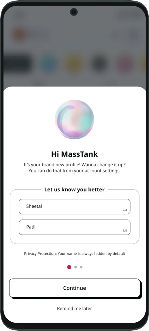
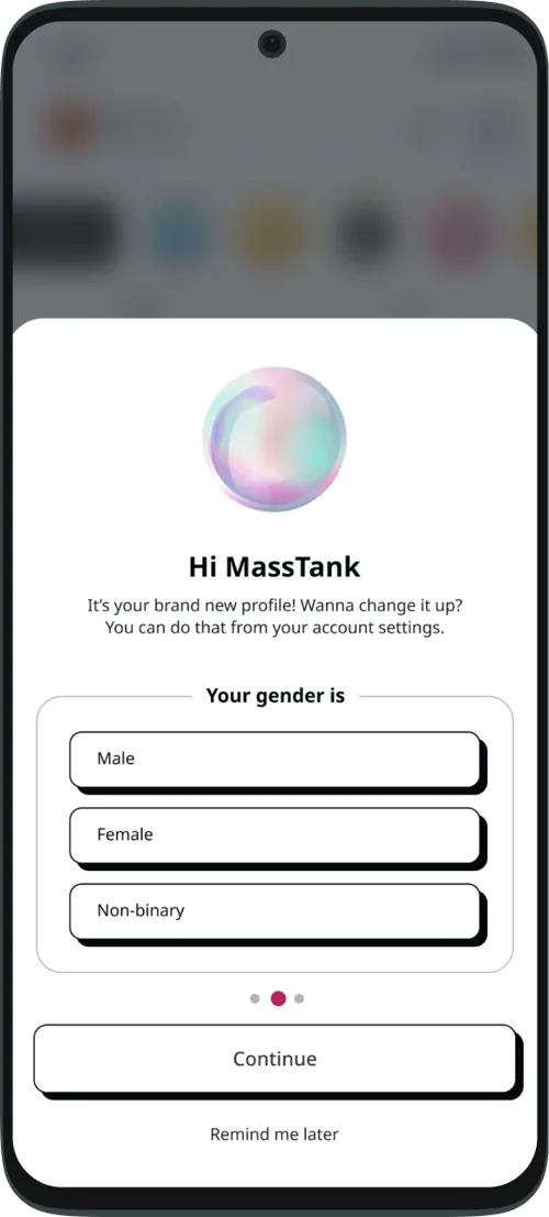
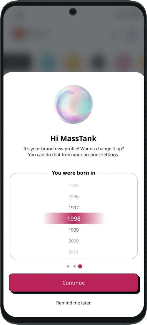
Form-filling instead of joining.
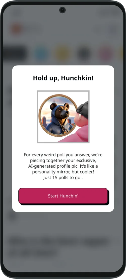
Payoff promised, not delivered.
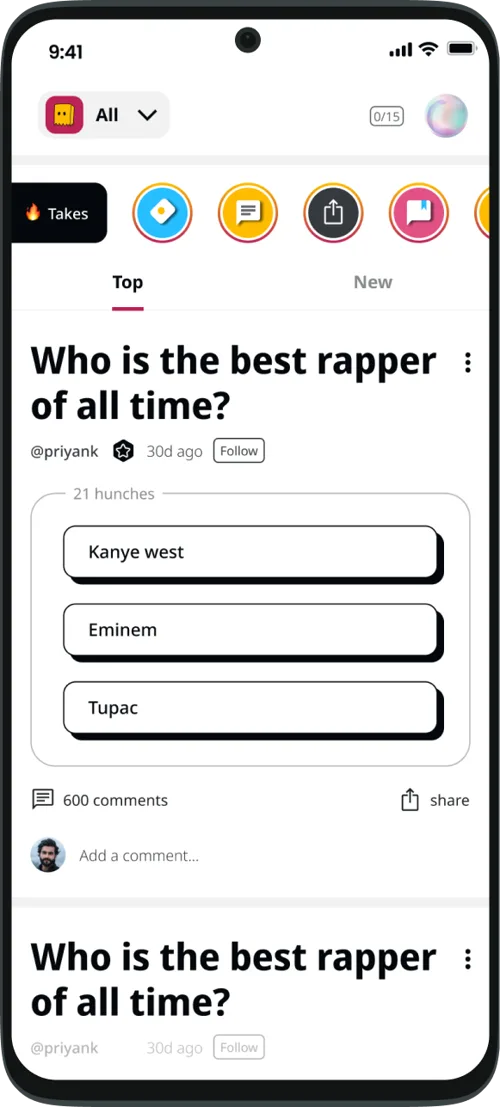
A feed without a reason to participate.
We reframed onboarding as a participation engine.
The strategy was not to add more screens. It was to change the user's state from "I am checking this app out" to "I have already participated in something." People don't return to products they only browse. They return to things they have participated in.
- •Express preferences early
- •Make the product feel personal, not empty
- •Show real people and communities are active
- •Make the space feel inhabited
- •Lightweight first action
- •Completable within seconds
We prioritized low-effort changes that could shift behavior quickly.
The strongest opportunities came from where users were doing work without reward.

setup felt like admin work before users understood why it mattered.
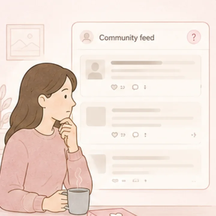
feed appeared without context on why this community was relevant.
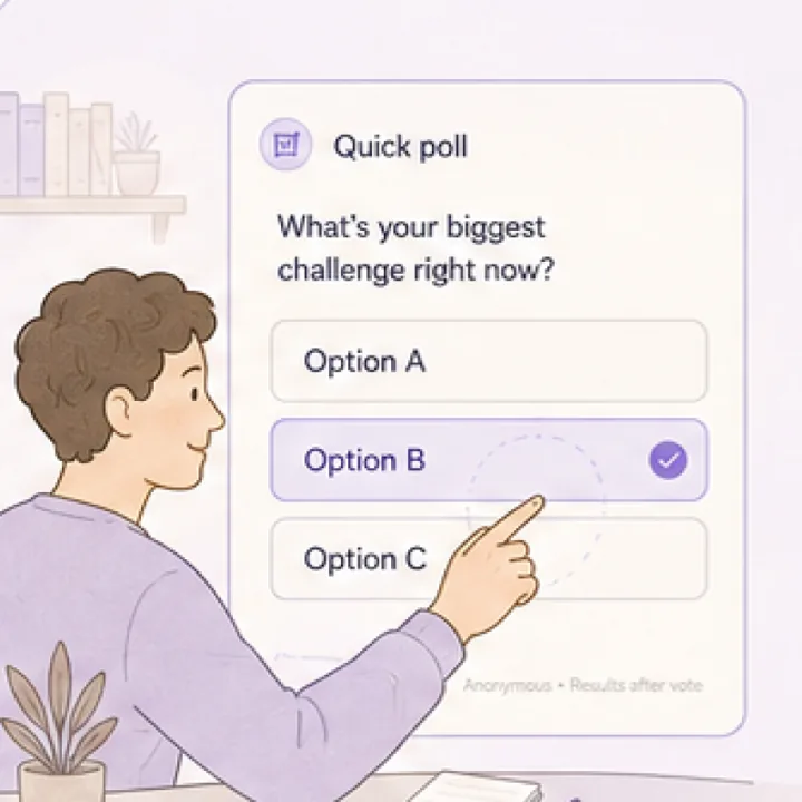
polls were sticky but not introduced as the main first-session action.
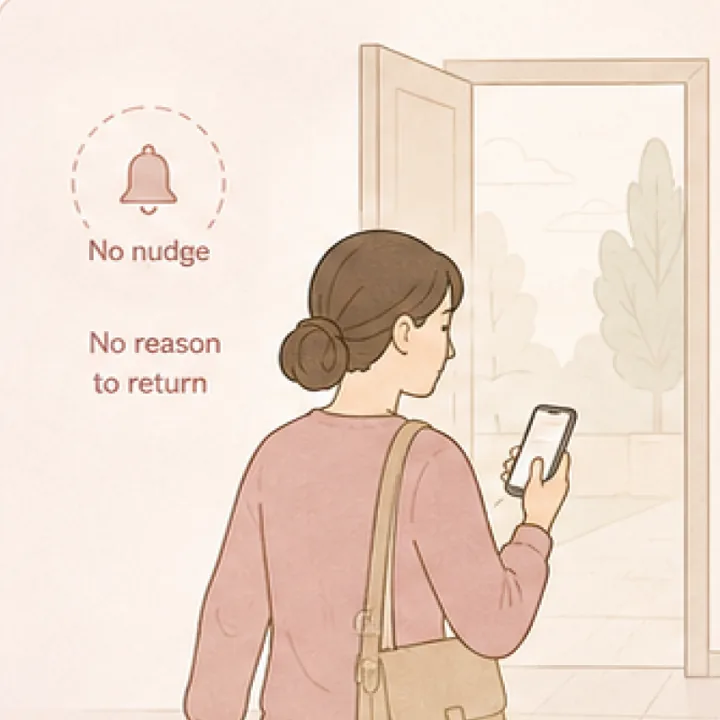
users lacked a strong reason to come back after leaving.
The redesigned FTUE had four behavioral layers.
Design principle: users should feel socially visible within the first minute. Success condition: the user should leave with an unresolved loop worth returning to.
Help users express who they are.
Interest selection and profile creation build early self-identity and relevance.
- Interest cues
- Profile signals
- Personal reflection
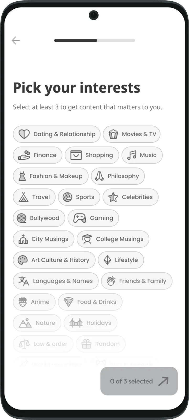
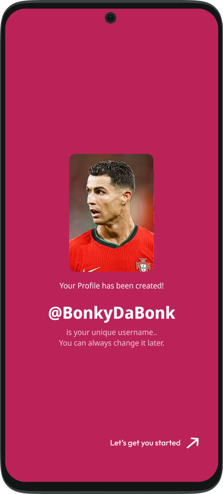
Users feel seen and the app feels made for them.
Turn observers into participants—fast.
Poll-first structure reduces friction and gets users to take their first action instantly.
- Poll-first action
- Low cognitive load
- Instant feedback loop
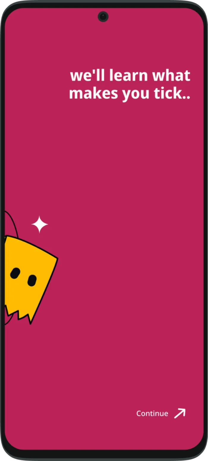
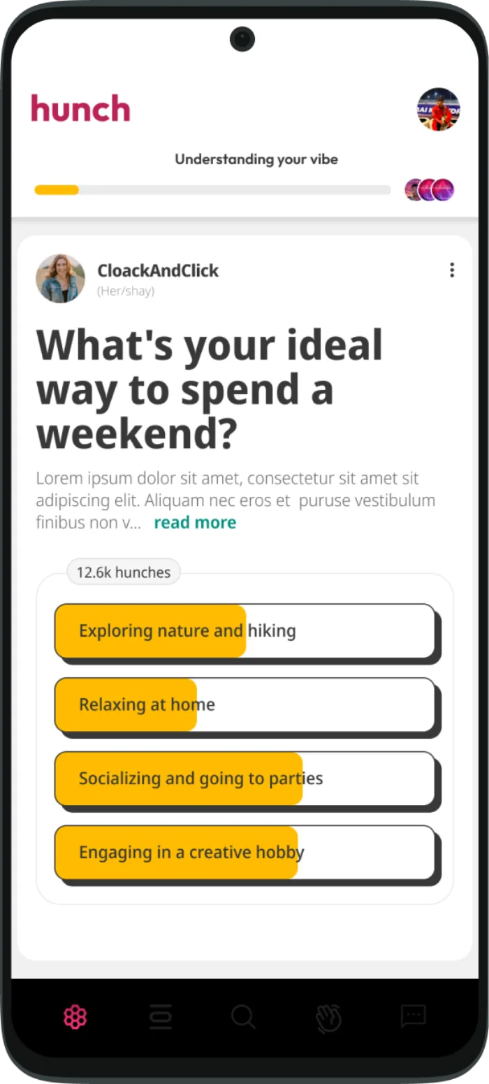
First action completed in under 60 seconds.
Show a live community, not an empty feed.
Expose users to real opinions and conversations to spark social connection.
- Community presence
- Social proof
- Live conversations
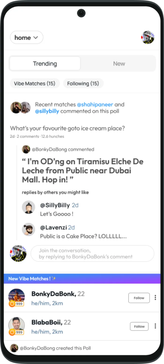
Users feel surrounded by people, not content.
Create an unresolved loop worth returning to.
Personalization progress and evolving feeds build anticipation and habit.
- Progress indication
- Personalized discovery
- Unresolved curiosity
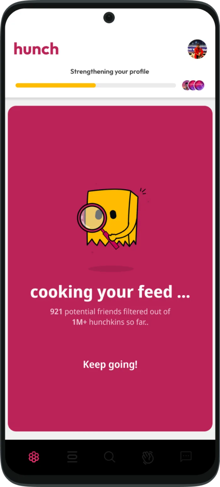
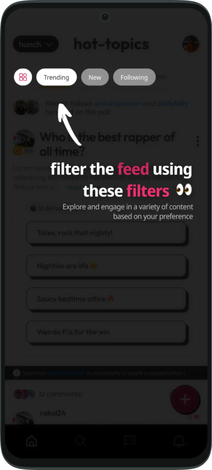
Curiosity + personalization = repeat behavior.
The redesign changed user behavior, not just screen order.
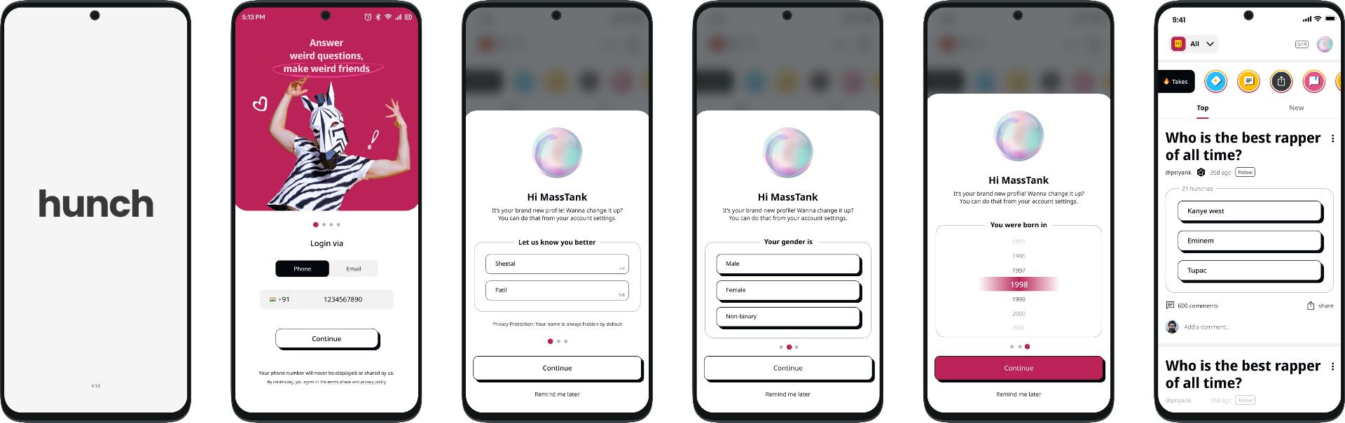
- Generic onboarding flow
- Content shown before context
- Profile felt like setup work
- Users left without an open loop
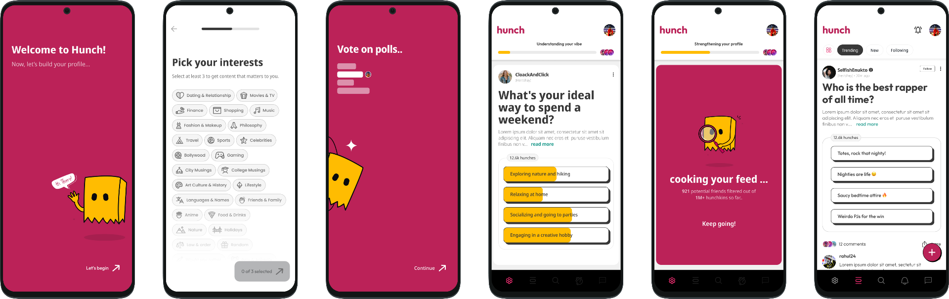
- Identity + relevance cues at entry
- Guided toward a first poll
- Profile inputs improve feed relevance
- Results + responses create a return reason
- Registration → self-expression
- Passive browsing → active participation
- Form-filling → personalization
- One-time session → repeat intent
The important decisions were about friction, not aesthetics.
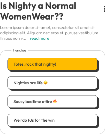
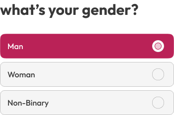

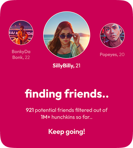
The new onboarding brought value forward.
Five tight stages, each with a clear design intent and a matching user payoff. The flow front-loads relevance and participation instead of administration.
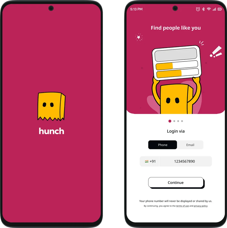
- •Intent: create clarity
- •Payoff: "I get this."
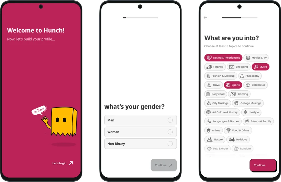
- •Intent: build relevance
- •Payoff: "This is for me."
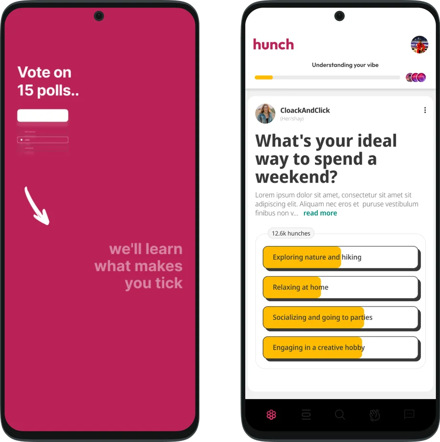
- •Intent: trigger action
- •Payoff: "I did something."
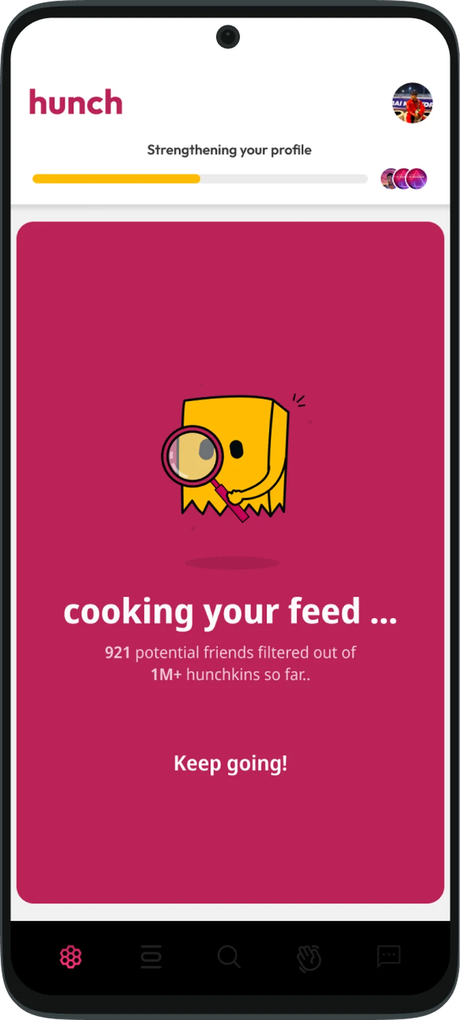
- •Intent: show social proof
- •Payoff: "Others are here."
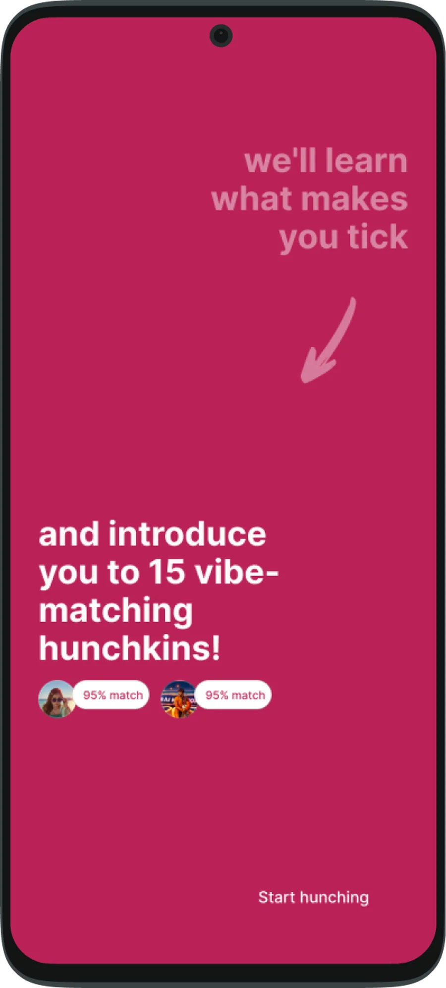
- •Intent: deepen investment
- •Payoff: "I should come back."
Mixpanel funnel · before vs after redesign
Behavioral analytics showed the biggest drop-off between profile completion and first interaction. Reducing onboarding friction and introducing interest-led prompts improved first-session participation significantly.
The biggest mistake in onboarding design is assuming users need guidance. What they actually need is a reason to act.
More case studies
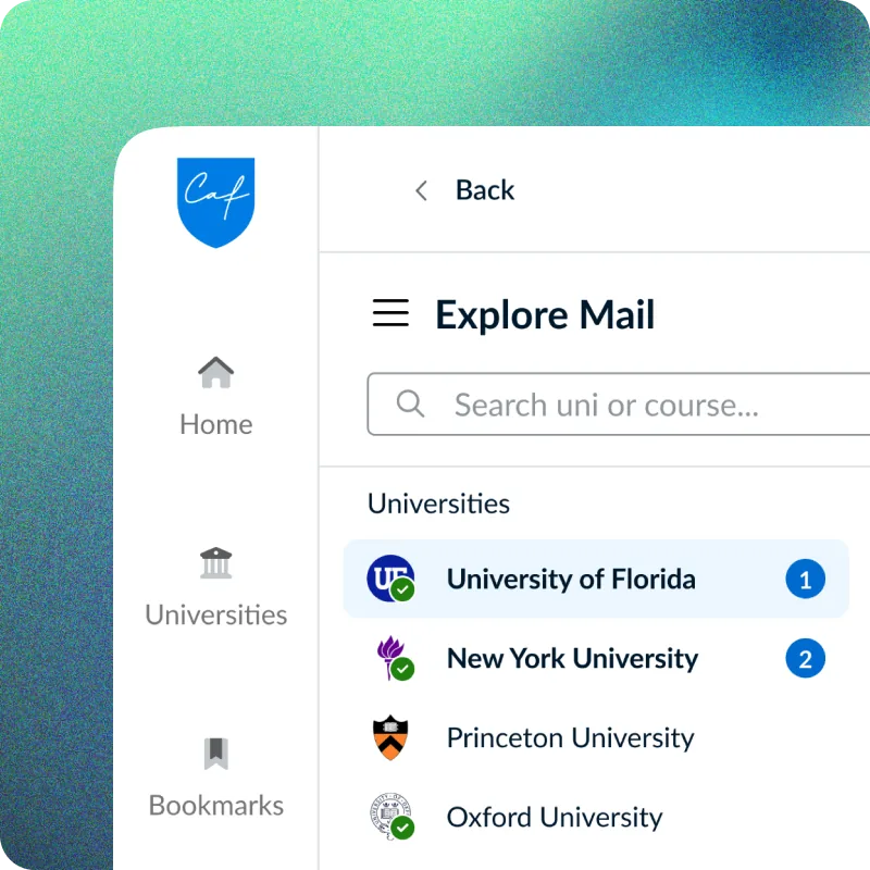
Built an in-house mail app, turning fragmented admissions emails into structured outcome intelligence.
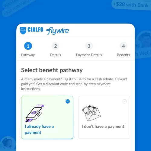
Tagged Flywire payments in ManifestGlobal to unlock rewards for parents/guardians